Detail. It’s all about the detail. I’m talking about writing historical fiction. You have to get it right. At the same time, you can’t put too much in. Too much detail and the reader gets bogged down. Sprinkle a few gleaming highlights, like fairy dust, through your story and, hey presto, you’ll work your magic.
They catch the eye, entice the senses, and beguile the mind.
The trick is to choose your details carefully. You need details that advance the story, as well as enrich the texture of the book.
That brings me on to the Case of The Missing Illustration.
In the book I’m writing at the moment, one of the characters, a child, owns a beloved copy of The Wind In The Willows by Kenneth Grahame. My story is set in 1914. For reasons I won’t go into here (potential spoiler) I wanted the book to be an illustrated edition, and the child in question to be fascinated by the illustrations.
Now the most famous and popular illustrations of Wind In the Willows are those by E.H. Shepard, the illustrator of Winnie the Pooh. Those were the ones I had in my mind. Ah, but when did the Shepard-illustrated edition come out? That’s the question. A quick visit to the Wikipedia page for Wind in the Willows, and I discovered that it wasn’t until 1931. So no good for my purposes.
The first edition of Wind in The Willows, which came out in 1908, was in fact not illustrated, apart from a frontispiece by Graham Robertson. That was a setback, I can tell you, because I’d really had my heart set on Shepard as my illustrator!
Time for a bit more digging.
Well, really just scrolling down the Wikepedia page.
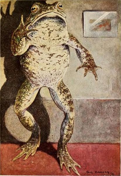
Fortunately for me, and my story, I discovered that the first illustrated edition came out in 1913 (which meant it was historically possible for my character to own a copy). The illustrator was Paul Bransom.
A bit of image searching showed that Bransom’s illustrations were very different to Shepard’s. For one thing, he tended not to dress his animals up in clothes, in the classic way of children’s books. I have to admit, I found the effect slightly unsettling at first.
But the thing was, I loved what I saw.
These pictures were perfect for my purposes. One in particular fascinated me, as much as I thought it would fascinate my character. One of Mr Toad, captioned “Dwelling chiefly on his own cleverness, and presence of mind in emergencies” (great caption, by the way).
But I wanted to see all the Bransom illustrations, just to make sure that there wasn’t another one that might serve my purposes better. It was hard to tell from googling whether I had eyeballed the full set. The only thing to do was to buy a copy of the Bransom-illustrated Wind in The Willows.
An original first edition would probably wipe out my advance.
So that wasn’t really an option. But I did find a Children’s Classics 1987 reprint on AbeBooks, which was billed as having the original Paul Bransom ‘color’ illustrations. Just what I was looking for, and for just a few quid rather than a few thousand.
Imagine my disappointment when I leafed excitedly through its pages to discover that, yes, it did contain the Bransom illustrations, but one, at least, had been omitted. That’s right. “Dwelling chiefly on his own cleverness, and presence of mind in emergencies” was nowhere to be seen.
I quickly downloaded the Penguin edition on Kindle. That also promised Bransom illustrations. To my relief, this time, the one I was interested in was included.
So why leave this superbly surreal image out?
I suppose I have my answer there, in the word ‘surreal’. Not the most child-friendly of artistic styles, you might say. Maybe the good people at Children’s Classics thought it was just too disturbing for 1980s kids (although those of 1913 were evidently strong enough to handle it)? The stuff of nightmares, perhaps.
But fortunately for me, it was in the 1913 edition. So it can go in my story.
As I said, it’s all about the detail.